Okay. Need some feedback, as I am not sure of the cover for volume 2. The only thing different between these 3 variants is the font on the Taste of Ashes. I’ve placed them in order from subdued to more colorful. Please let me know which one you guys prefer. Thanks!
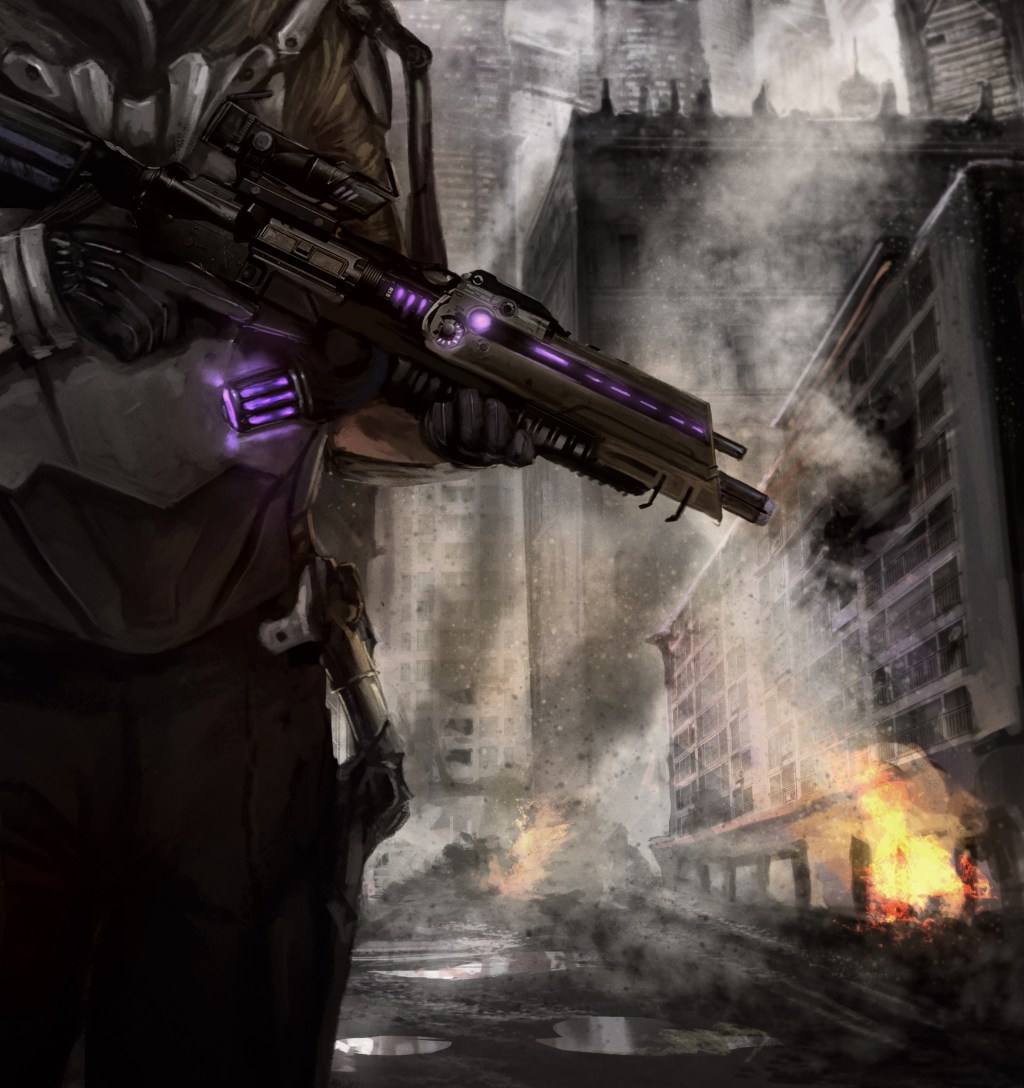


I prefer #3 and I also think your name larger and more distinct might be an idea to consider. The line under ‘ECHO’ feels like it’s too close to the word. But I’m nitpicking, still very effective cover design.
LikeLiked by 3 people
I like three, though I feel one is more legible I would be more likely to pick up three because it jumps out at me.
LikeLiked by 1 person
#3. But it’s still hard to read “The Taste of Ashes” or your name. I think both of them need to be brighter, larger font or just easier to read. My two cents. Good luck!
LikeLiked by 1 person
I agree with Jason on not being able to see your name very well. But I think the subtitle is better in the color of ash, so #1 would be my choice with your name more prominently displayed, either a little bigger font or in a color that will show up better.
LikeLiked by 2 people
#3. Simply because it pops out the at readers eye more, being directly underneath the main title already. It looks great! 🙂
LikeLiked by 1 person
“THE TASTE OF ASHES” is easier for me to read in #1
I agree with the others about you name being difficult to read.
LikeLiked by 1 person
#1 – simple, easy to read, a bit more slick.
LikeLiked by 1 person
I like the look of #2, not too flashy. But I agree with the others comments here. #1 is more easy to read.
LikeLiked by 1 person